Sunday, 30 March 2014
Final Front Cover, Contents Page and Double Page Spread
To navigate the prezi, click and drag into and around the page.
Friday, 28 March 2014
Audience Research Part 2
I asked members of my target audience to comment on my magazine so far. I have shown them all three parts of the magazine and requested of them to comment on and suggest improvement on my magazine.
Tuesday, 25 March 2014
When Life Gives You Photoshop
A few months ago I was face-to-face with a blank page on a computer screen.
Then week by week a magazine was being put together with the goal of what I had in my imagination.
But how did I make it?
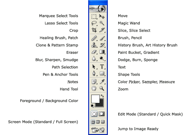 |
| Photoshop tool bar |
Once images have been placed onto the Photoshop page, you can do anything; the possibilities are limitless.
Front Cover
First, using the paint brush, I designed a suitable background for the main images and masthead. I created a spotlight effect by making an all back background and erasing a circle in the centre with the fading setting, allowing a gradient effect.
Then using the text button, I wrote the masthead, tag line, strip, cover lines and all writing on the front cover. Of course I altered the colour to whatever suited it's background.
Different fonts include 321Perfect, American Typewriter, Forgotten Junk and BlairMdlTC TT.
Using the eraser and magic wand I was able to edit backgrounds out of photographs and pictures so they look more appropriate and less blocky. Pictures are placed by clicking 'file' and 'place', selecting your image and 'place'.
I used the shape tool to create rectangles and circles for the top left 'win' puff and the strip at the bottom. Again I changed the colour to fit what was behind.
I place a picture of a photo of a real band, as I cannot make one for them.
Contents Page
With the text tool I wrote 'Inside' instead of 'Contents', I thought this would make what is actually inside more exclusive and as if it was a secret for the reader.
I asked a friend of mine to tweet about the band Paramore, so I screen-capped it, and placed it into the contents page. This allowed social media and followed the colour scheme.
I have inserted fan photos and my photos onto the contents page, with no burning or erasing, all were placed and left with not editing.
Using the shape tool I inserted red rectangles behind the sub-titles of the page.
Using the paint brush tool I created a gradient background using different shades of grey, getting darker as the enclose to the center.
Different fonts 321Perfect, Impact, American Typewriter and Belle Gothic.
Double Page Spread
After placing my main image of my model, I erased all of the background behind her.
I made a light grey background and with the text tool I wrote 'skull' (the name of the artist) in a lighter shade of grey to add diversity and make the page look full.
I have stuck with the colour theme, however there is not yellow, as there was no yellow worn by my model.
Fonts include MS Referance Sans, Silom and Abadi MT Condensed Extra Bold.
Colour Scheme
Colours.
Colours help us to identify. To see. To feel. To understand.
I thought I'd take a moment to step back and appreciate how colours help when it comes to art and projecting your feelings and emotions through the media and everyday life.
I focused on three main colours for my magazine:
Black
Red
White
... and a little bit of Yellow.
Red and yellow are colours. Red connotes love or violence, which goes well with my model Angela's dress as it has roses. Yellow on the other hand could connote warmth, but I specifically have chosen an acid yellow, allowing something destructive despite it being a happy colour.
Black and white are shades, so I used these at different levels. I have used grey, bright white, and the darkest black.
Not only does this offer a diverse range of colours and shades but allow the audience to understand the theme of this magazine. As I have mentioned in a previous post, this can connote bad things among the good.
Contents Page Re-draft & Progress

I wish to add more photos for this page to be more ascetically pleasing and for 'FREE ISSUE' to be brighter and bolder. My letter from the editor will be moved to a more symmetrical and organised place.
I like how the colour theme as remained the same, and playing with the yellow has allowed it to be more diverse and colourful.
A bar at the bottom of the page has mentioned social media sites, twitter, facebook and tumblr. 'follow/like us' makes it imperative that my audience will get involved online, further publicizing this magazine.
Subscribe to:
Posts (Atom)